





Embedded analytics tools let you put dashboards, reports and charts inside your own product, so your customers get insights without ever leaving your app. This guide compares 13 embedded analytics tools on pricing, multi-tenancy, white-label support and the data layer each one assumes you already have.
The market has changed shape over the last two years. Traditional BI vendors bolted on embedding modes, a wave of SaaS-native platforms launched with embedding as the core product, and consolidation started, with Omni acquiring Explo in October 2025 and giving existing Explo customers roughly twelve months to migrate.
Analysts size the embedded analytics market between $27 billion and $57 billion in 2026 depending on methodology, growing at 11-16% annually, with cloud deployments taking roughly 64% of it. The reason is simple: analytics stopped being a separate destination and became a product feature customers expect.
What most comparisons skip is that every tool on this list needs a governed, multi-tenant data layer underneath it. That is usually where embedded analytics projects actually stall.
What are embedded analytics tools?
Embedded analytics in one definition
The distinction matters commercially. Internal BI serves a defined team, so per-seat pricing is predictable. Embedded analytics serves your entire customer base, so per-seat pricing becomes a tax on your own growth. Understanding BI inside a data warehouse is the starting point for getting that economics right.
The build versus buy math
Before comparing tools, it is worth being honest about the alternative. Most engineering teams underestimate what building embedded analytics in-house actually costs.
What building in-house costs in 2026
- Year one: $181,000 to $310,000 for a production-grade embedded analytics module
- Three-year total: $371,000 to $630,000 building, versus $150,000 to $360,000 buying
- Time to first dashboard: six to twelve months building, four to eight weeks buying
- Team required: typically two senior engineers dedicated for the duration
- Regret rate: 29% of teams that built regretted it within a year, against 18% who bought
- Default posture: 61% of data teams now start from buy-first
The hidden risk is multi-tenancy. Row-level security misconfiguration is the most common way embedded analytics leaks one customer’s data to another, and it is far easier to get wrong in a custom build than most teams assume. Purpose-built platforms handle tenant isolation as a first-class concern. Home-grown implementations frequently do not.
What to look for in embedded analytics tools
Seven evaluation criteria that actually separate these tools
That second-to-last point is the one that derails timelines. A charting SDK renders whatever you give it, so if the pipelines, joins and tenant keys are not already in place, you have bought a front end for a back end you still have to build. Getting SaaS data integration right first is what makes the rest go quickly.
Top 13 embedded analytics tools in 2026
1. Peliqan: the data layer plus white-label delivery
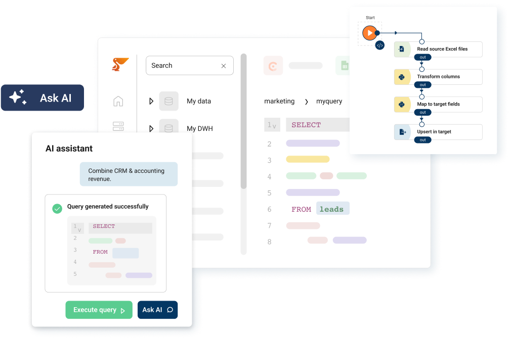
Peliqan is not a charting SDK, and it is on this list for a different reason than the other twelve. It is the all-in-one data platform that sits underneath customer-facing analytics: 300+ connectors, a built-in data warehouse on Postgres and Trino, transformations, and white-label multi-customer management in a single product.
Where Peliqan fits in an embedded analytics stack
The practical pattern is to use Peliqan for ingestion, modelling, tenant isolation and governed delivery, then either build the customer-facing views as low-code Python data apps or feed a dedicated visualisation tool through published APIs.
Pricing is a fixed subscription rather than per viewer, which is the pricing shape that matters when your audience is every customer account you have. Connect starts at EUR 75 per month per data source and PRO at EUR 500 per month, both on a 12 month contract. New custom connectors are built within two weeks, so a niche source in one customer’s stack does not become a roadmap item.
Tenant boundaries are enforced through granular permissions rather than left to application code, which is where most home-grown multi-tenant analytics leaks.
Real-world example: OdooExperts
OdooExperts consolidated reporting across a large number of separate client environments using Peliqan’s multi-customer management, running one platform instead of one deployment per customer. Read the full case study.
Best for: SaaS companies and data teams that need the pipeline, data warehouse, tenancy and white-label configuration solved together, with predictable pricing as customer count grows.
Limitations: If you already run a mature governed data warehouse and only need a polished charting SDK to drop into a React app, a dedicated visualisation tool below will get you there with less surface area.
2. Draxlr
Draxlr is a self-serve embedded analytics tool for SaaS teams that want white-label, customer-facing dashboards live in days. It connects directly to SQL databases like PostgreSQL and Databricks, so there are no extra pipelines or infrastructure to stand up before the first dashboard. Multi-tenant filters and row-level security make sure each customer sees only their own data, and Full App Embedding goes a step further by giving every customer their own analytics workspace inside your product.
Pricing is published and flat: Premium from $75 per month and Power from $250 per month, both with unlimited external viewers and a 7-day free trial, with Custom and Self-Host plans above that. Because viewers are never billed, cost stays flat as your customer base grows.
Best for: SaaS teams that want fast, affordable customer-facing analytics on their existing SQL database.
Limitations: Reads from a SQL database you already have, so pulling data in from SaaS sources and modelling it still happens upstream. Premium covers two database connections.
3. Luzmo
Luzmo is a SaaS-native embedded analytics platform built for product teams rather than internal BI. It is one of the cleanest developer experiences on this list, with a strong component model and good theming.
Pricing is published, which is rare in this category: a single All-in plan from EUR 1,995 per month billed annually, with no tiers and no per-seat licensing. It holds a 4.6 out of 5 rating on G2 across 76 reviews, the highest score in this comparison, though on a smaller review base than the enterprise incumbents.
Best for: Product teams that want fast time-to-dashboard with transparent pricing.
Limitations: Assumes you bring a clean data source. Heavy modelling work still happens upstream, and the single plan means there is no cheaper entry point to start on.
4. Qrvey
Qrvey targets SaaS providers that want a full analytics stack rather than a visualisation layer, including data ingestion and a self-service builder for end users. It deploys into your own cloud environment, which appeals when data residency or isolation requirements are strict.
Pricing is not published and requires a sales conversation, so budget planning needs a discovery call before you can model total cost.
Best for: SaaS vendors needing embedded analytics inside their own AWS account.
Limitations: No public pricing, and self-hosted deployment carries infrastructure overhead.
5. Sisense
Sisense is one of the established embedded analytics platforms, aimed at mid-market and enterprise deployments. G2 rates it 4.2 out of 5 across 1,039 reviews.
It does not publish pricing. The site lists a Self-serve tier and an Enterprise tier, both routed through a sales conversation, so sizing the cost needs a discovery call before you can compare it against the platforms that do publish rates.
Best for: Mid-market teams wanting a mature, established platform and willing to go through procurement to get one.
Limitations: No public pricing, so evaluation starts with a sales call, and white-labelling sits behind the higher tier.
6. Explo
Explo built a strong reputation for fast, developer-friendly embedded dashboards. The important 2026 context is corporate: Omni acquired Explo in October 2025, and Explo has been operating as a wholly owned subsidiary with the platform running for roughly twelve months while customers migrate to Omni.
That makes Explo difficult to recommend for a new build today, though it remains relevant if you are already on it and planning a migration path.
Best for: Existing customers evaluating the Omni migration.
Limitations: Effectively sunsetting as an independent product.
7. Embeddable
Embeddable takes a code-first, component-based approach aimed squarely at engineering teams who want the embedded experience to feel genuinely native rather than iframed. The model gives you a lot of control over the rendered output.
Pricing moved behind a sales conversation during 2026. Earlier published material referenced a Lite plan around $499 per month, but the pricing page now describes a flat monthly subscription with unlimited usage and directs buyers to a custom quote, so treat older figures as historical.
Best for: Engineering-led teams wanting fully native-feeling embedded components.
Limitations: Requires front-end engineering investment and no longer publishes rates.
8. GoodData
GoodData is an enterprise-grade platform with a genuine semantic layer and strong multi-tenant support, which is one of the more mature answers to the tenancy problem in this list. It carries a 4.3 out of 5 rating on G2 across 623 reviews.
Pricing is custom with no public rate card. The Professional plan is priced per workspace, a platform fee plus the number of workspaces, and Enterprise is priced by use case.
Best for: Enterprises needing a robust semantic layer and mature multi-tenancy.
Limitations: Enterprise sales cycle and pricing opacity.
9. ThoughtSpot Embedded
ThoughtSpot leads with natural-language search and AI-driven exploration, embedded through its developer SDK. If the differentiator you want to ship is “let customers ask questions in plain English”, this is the most direct route. G2 rates it 4.4 out of 5 across 340 reviews.
Pricing is published per user: ThoughtSpot Analytics Essentials from $25 per user per month and Pro from $50 per user per month, both billed annually, with Enterprise on request. ThoughtSpot Embedded also has a Developer tier that is free for the first year, up to 10 users, which makes it far cheaper to trial than its enterprise reputation suggests.
Best for: Products where conversational analytics is the headline feature.
Limitations: Per-user pricing scales against you as your customer base grows, and AI answers are only as trustworthy as the modelled data underneath.
10. Domo Everywhere
Domo Everywhere is the embedded arm of the wider Domo platform, offering broad connectivity and a large visualisation library. It holds a 4.3 out of 5 rating on G2 across 1,044 reviews, the largest review base here.
Domo does not publish pricing, and it runs a consumption model based on an annual pool of credits. Enterprise deployments commonly reach $50,000 or more per year, so it fits organisations already standardising on Domo internally.
Best for: Existing Domo customers extending analytics to external users.
Limitations: Enterprise pricing, credit consumption that is hard to forecast, and a heavier platform footprint than a focused embedding tool.
11. Metabase
Metabase is the most accessible entry point on this list and the open-source option most teams try first. The commercial plans start with Starter at $100 per month, which includes five users and adds $6 per user beyond that. Interactive embedding, where customers sign in to view dashboards, sits on Embedded Analytics Pro at $575 per month including ten users, then $12 per user, with enterprise plans starting around $20,000 per year.
The per-user component is the thing to watch. It is very reasonable at ten customers and becomes the dominant line item at a thousand.
Best for: Early-stage products validating whether customers want analytics at all.
Limitations: Per-user pricing scales poorly, and deep white-labelling requires the higher tiers.
12. Power BI Embedded
Power BI Embedded lets you place Power BI reports, dashboards and tiles inside your own web applications using capacity-based pricing rather than per-viewer licensing, which is a meaningfully better shape for customer-facing analytics than standard Power BI licensing.
It is the pragmatic choice when your organisation already runs on Microsoft, and teams already connecting data to Power BI internally will find the modelling work transfers directly.
Best for: Microsoft-centric organisations with existing Power BI investment.
Limitations: Capacity sizing is genuinely hard to forecast, and the embedded experience carries Power BI conventions that are difficult to fully disguise.
13. Cube
Cube is a headless semantic layer rather than a visualisation tool. It sits between your data warehouse and whatever front end you choose, providing consistent metric definitions, caching and an API. Teams pair it with their own charting library to build a fully custom experience.
Pricing runs from a free tier through Starter at $40 per developer per month and Premium at $80 per developer per month, with Enterprise on request. The open-source project remains available to self-host.
Best for: Engineering teams building a bespoke analytics front end that still needs governed, consistent metrics.
Limitations: Ships no UI. You are still building the entire visual layer yourself.
Embedded analytics tools compared
Vendor pricing checked October 2026. Five of the thirteen publish no rates at all, and published figures in this category change frequently, so confirm on the vendor’s own pricing page before budgeting.
Embedded analytics pricing: what to expect
Pricing in this category splits into four shapes, and the shape matters more than the headline number.
Four pricing models and how each behaves at scale
Whatever shape you pick, model it at three times your current customer count before signing. A tool that costs $500 per month at fifty customers and $9,000 per month at five hundred has quietly become the most expensive line in your infrastructure. The same discipline applies to the data warehouse underneath, which is why data warehouse as a service pricing deserves the same scrutiny.
One practical note on evaluation timelines: Qrvey, Sisense, Embeddable, GoodData and Domo all route pricing through a sales conversation. If you are comparing on cost, a large part of the shortlist cannot be compared without booking calls first, so build that into the schedule rather than discovering it a week before a decision is due.
The layer most comparisons skip
Every tool above renders data. None of them create it, clean it, join it or keep it separated by tenant. The same gap shows up in adjacent categories, which is why customer data platforms increasingly bundle ingestion rather than assuming it. That work sits upstream, and it is where embedded analytics projects usually run long.
A realistic customer-facing analytics feature needs source data pulled from wherever it lives, modelled into metrics that mean the same thing across dashboards, isolated through multi-customer management so tenant A cannot see tenant B, refreshed on a schedule your customers trust, and monitored so a silent pipeline failure does not surface as a wrong number in your product.
Questions to ask before you pick a visualisation tool
- Where does the data land? If the answer is “we will figure that out”, that is the project, not the charts
- Who enforces tenant isolation? Application code is the riskiest possible answer
- How do metrics stay consistent? Without a shared definition layer, dashboards drift apart
- What happens when a pipeline fails? Customers see stale numbers before you do unless something is watching
- Who owns the refresh schedule? Customer-facing data has a much lower tolerance for lag than internal reporting
Teams that answer these first ship faster, because the visualisation layer becomes a genuine choice rather than a workaround. Setting up materialised tables for the queries your dashboards hit most is usually the difference between a snappy embedded experience and a slow one.
Ongoing data quality monitoring matters more in embedded analytics than internal BI, because the audience for a broken number is your customer rather than your analyst.
CIC Hospitality consolidated more than 50 data sources and saved over 40 hours a month on reporting by fixing this layer first, which is the same groundwork any customer-facing analytics feature depends on. Where the output needs to flow back into operational systems, reverse ETL tooling closes that loop.
How to choose the right embedded analytics tool
A short decision framework
- No data warehouse yet, SaaS product, many customers: solve the data layer and tenancy first, then choose a front end
- Clean data warehouse, want speed: Luzmo or Embeddable for a native-feeling component model
- Already on Microsoft: Power BI Embedded, using capacity pricing rather than per-viewer licensing
- Validating demand cheaply: Draxlr, Metabase, or ThoughtSpot Embedded’s free Developer year, accepting that per-user pricing will need revisiting
- Conversational analytics is the feature: ThoughtSpot Embedded
- Building a fully custom front end: Cube for the semantic layer, your own charting library on top
- Strict residency or isolation rules: Qrvey in your own cloud, or an EU-hosted data layer
One caveat on the list above: the right answer changes if your customer count is about to move by an order of magnitude. Tools that are comfortable at fifty tenants behave very differently at five hundred, and the migration cost is high enough that it is worth choosing for where you will be in two years. Teams weighing broader options often start by reviewing data warehouse tools and working upward from storage.
Conclusion
The embedded analytics tool market is mature enough that most of these products will render a competent dashboard. The decision rarely comes down to charting quality. It comes down to pricing shape as you grow, how tenant isolation is enforced, how much white-labelling is real, and whether you already have a governed data layer for the tool to read from.
If you have that layer, pick the front end that matches your engineering appetite: Draxlr for a fast, flat-priced start on your SQL database, Luzmo or Embeddable for speed and polish, Cube for full control, Power BI Embedded if you are already on Microsoft.
If you do not, that is the project. Peliqan combines the data warehouse, 300+ connectors, transformations, multi-customer management and white-label delivery in one platform, at fixed pricing that does not climb with every customer you add. You can build the customer-facing views directly on it, or publish governed APIs and use any visualisation tool you prefer.
See how a white-label data warehouse works or start a free trial to test it against your own data.