




A Pipedrive dashboard turns the deals sitting in your CRM into a picture of what is actually going to close. Pipedrive builds one for you inside Insights, and for most sales teams that is enough. This guide covers what to put on a Pipedrive dashboard, how to build one, exactly where the native reporting stops, and the three routes teams take when it does – including one that skips the BI tool entirely.
What a Pipedrive dashboard actually is
Pipedrive’s reporting lives in a feature called Insights, and Insights has three parts that people often mix up. Reports are the individual charts, each one built from a single entity such as deals, activities or leads. Goals are targets you attach to a metric so progress is tracked against a number. Dashboards are the panels that hold reports and goals together in one view.
So a dashboard is a container, not a data source. Every tile on it is a report you built first. That distinction matters the moment you want a tile that combines two entities, because the limit is set at the report level, not the dashboard level. Pipedrive’s own documentation is clear on the split.
The three parts of Pipedrive Insights
What belongs on a Pipedrive dashboard
A dashboard that tries to show everything shows nothing. The teams that get value from Pipedrive reporting tend to run three or four focused dashboards rather than one crowded panel, and they group metrics by the question each one answers.
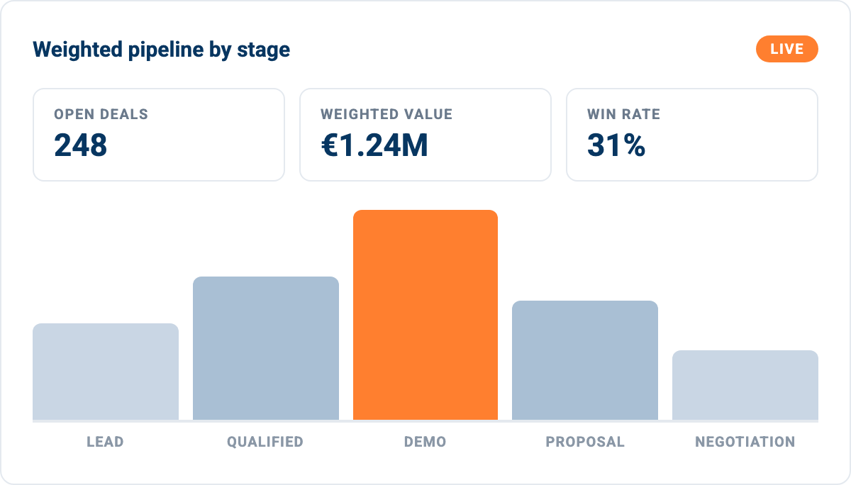
Three tiles and one stage breakdown answer most pipeline questions. Anything beyond this belongs on a different dashboard.
Pipeline health: what is in play right now
These are the metrics that describe the shape of the funnel rather than the outcome. Open deal count by stage tells you whether the top of the funnel is feeding the bottom. Total and weighted pipeline value tell you what the quarter looks like if nothing changes. Average deal size flags whether reps are chasing the right profile. Deal age and stage duration surface the deals that have quietly stalled, which is usually the most actionable tile on the whole board.
Performance: what actually closed
Won and lost deals by period, win rate by rep and by source, sales velocity, and average time to close. Lost reasons deserve their own tile because it is the one field that explains the others. If your win rate drops and lost reasons are dominated by pricing, that is a different problem from losing on timing.
Activity: what the team is doing
Calls, emails, meetings and demos booked, split by rep and by period. Activity metrics are leading indicators, so they are the ones worth putting on a weekly team dashboard rather than a monthly management one. A drop in meetings booked shows up in closed revenue two months later.
Build one dashboard per audience, not one per person
- Rep dashboard: My open deals, my activities this week, my quota progress. Activity-heavy, refreshed daily.
- Manager dashboard: Pipeline by stage, win rate by rep, deals with no activity in 14 days. Coaching-oriented.
- Board dashboard: Weighted pipeline, forecast versus target, revenue by source. Monthly, and it needs to survive scrutiny.
How to build a Pipedrive dashboard step by step
The build order in Pipedrive runs backwards from what most people expect. You create the reports first, then the dashboard to hold them, then arrange the tiles.
Build the reports first
1. Open Insights and create a report. Click Insights in the left navigation, then Create, then Report. Choose the entity you are measuring – deals, activities, leads, mail, projects or revenue. Each entity exposes a different set of fields, and you cannot change the entity later without rebuilding the report.
2. Set measure by, view by and segment by. Measure by is the number on the axis, such as deal count, deal value or weighted value. View by is the grouping, usually stage, owner, time period or source. Segment by splits each bar or line into a second dimension. Getting these three right is the whole job; the chart type is cosmetic by comparison.
3. Filter down to the population you mean. Filter to open deals only for pipeline tiles, and to won deals for performance tiles. Mixing them produces a chart that looks fine and answers nothing. Save the report with a name that says what it measures, not what it looks like.
Then assemble and share the dashboard
4. Create the dashboard and add your reports. Back in Insights, create a dashboard, name it after its audience, and add the saved reports as tiles. Drag to rearrange, resize the blocks that matter most, and remove anything nobody has asked about in a month.
5. Add goals where a number has a target. Goals attach a target to a metric and track progress against it, turning a descriptive chart into something a rep can act on. They work per user, per team or per pipeline.
6. Share it. You can share dashboards with other Pipedrive users in your account, or publish a link for people outside it. The public link is how most teams get a dashboard in front of an investor or a board member who does not have a seat.
Where Pipedrive Insights stops
This is the part most dashboard guides leave out, usually because they are published by a tool that wants to sell you the fix. The limits are real, they are documented, and knowing them early saves you from building a reporting process that hits a wall in month three.
Reports are capped per user, by plan
Your subscription tier caps how many reports each user can create: 15 on the entry plan, 30 on the next tier, 150 on the professional tier, and unlimited at enterprise level. For a single sales manager that ceiling is generous. For an operations team maintaining reports on behalf of several pipelines and regions, 15 or 30 goes quickly.
Custom fields are gated
Most companies keep the data that makes their reporting specific in custom fields – contract type, region, product line, renewal date. In Insights, using deal custom fields in the measure-by, segment-by and view-by dropdowns requires the higher plans. Custom fields on people and organisations are more restricted still. If you have invested in a custom field taxonomy and cannot filter reports by it, the dashboard reflects a generic version of your business rather than yours.
Cross-object reporting is limited
Each report draws on one entity. Pipedrive has added the ability to combine some linked item data in reports, which helps, but the general shape holds: a question that spans deals, activities and organisations in one calculation stays awkward or impossible natively. Questions like “win rate for organisations with more than three logged calls, by region” are exactly the ones a sales leader asks and Insights struggles to answer.
There is no recurring revenue view
Insights does not cover MRR, ARR, net revenue retention or expansion. Subscription businesses running on Pipedrive end up calculating these in a spreadsheet from an export, which means the number in the board pack and the number in the CRM drift apart.
Data outside Pipedrive is invisible
The biggest constraint is not a feature gap, it is a boundary. A Pipedrive dashboard can only show Pipedrive data. Closed-won deals matched to invoices in your accounting system, pipeline against delivery capacity, CRM against product usage – none of that is a Pipedrive report, because half the data lives somewhere else. This is the point where teams start looking at a central data warehouse instead of a CRM report.
Signs you have outgrown native Insights
- You export to a spreadsheet every month: The export is the tell. Whatever you rebuild in the sheet is what the dashboard cannot do.
- Your board number and your CRM number differ: Two sources of truth means one of them is a manual calculation.
- You need history: Insights shows current state well. Reconstructing what the pipeline looked like on the first of last month is far harder.
- You need to join CRM to finance or product data: No native report crosses that boundary.
Three routes beyond the native dashboard
When Insights runs out, teams take one of three paths. They are not mutually exclusive, and the right one depends on who maintains it after you build it.
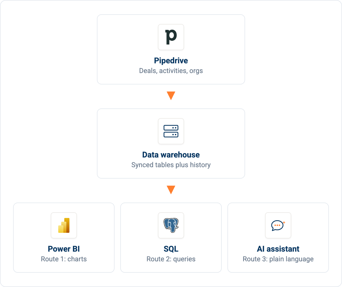
All three routes share the same first two steps. Only the layer on top changes.
Route 1: Pipedrive to a BI tool
Power BI, Looker Studio and Tableau all handle Pipedrive data well once the data reaches them. You get proper joins, calculated measures, history if you store snapshots, and visual control that Insights does not offer. This is the standard answer for a company that already has a BI licence and someone who knows the tool.
The catch is the pipe. Pipedrive’s API is fine for moving records, but pointing a BI tool straight at an API means rebuilding pagination and rate-limit handling, and it means your refresh time grows with your deal count. Most teams put a database in between, then connect the BI tool to that rather than to the CRM directly.
That middle layer is also what makes the refresh predictable. The Power BI connection guide walks through the DirectQuery setup for exactly this pattern, where the BI tool reads from a data warehouse rather than hammering the CRM on every refresh.
Route 2: Pipedrive to a database
Syncing Pipedrive into MySQL, PostgreSQL or a cloud data warehouse gives you SQL over your CRM. That solves cross-object reporting immediately, because a join is just a join once the data is in tables. It also solves history, if you materialise snapshots on a schedule.
This route suits teams with someone comfortable in SQL and a reason to keep CRM data alongside other systems. Once your sync lands deals, activities, organisations and persons as tables, the questions Insights refused to answer become ordinary queries. Materialising the heavy ones as tables keeps dashboard load times reasonable, and the materialisation docs cover the scheduling side.
Route 3: A live dashboard without a BI tool
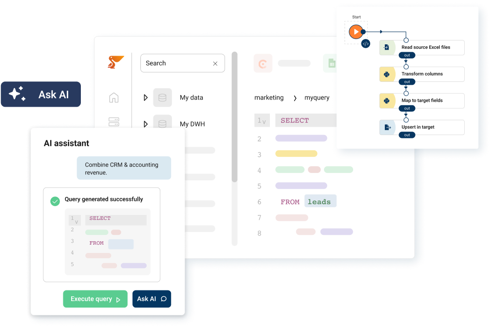
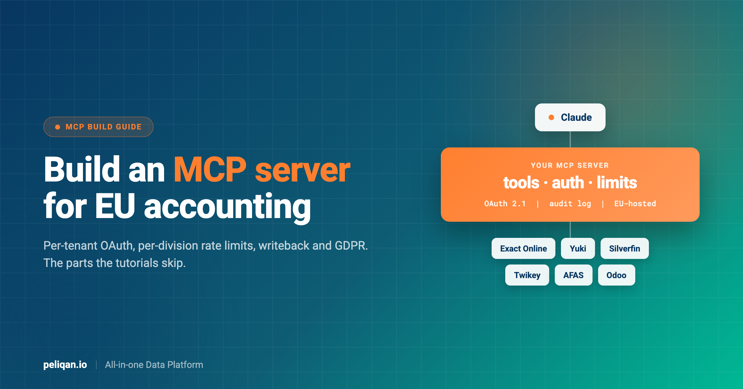
The third route is newer and it suits the case where nobody on the team wants to own a BI licence. You sync Pipedrive into a data warehouse as in route two, then put an AI assistant in front of the data warehouse through the Model Context Protocol. Instead of building a chart, you ask for one, and the assistant writes the SQL, runs it against synced data and returns the answer or the dashboard.
This is not a hypothetical setup. In Peliqan’s production usage data, one company’s CEO runs weighted pipeline dashboards this way, refreshing them on request and exporting a frozen snapshot as a standalone page when it needs to go to someone outside the business. The Pipedrive MCP server is what connects the assistant to the data.
What asking for a dashboard looks like in practice
The same setup answers questions a dashboard cannot
Once Pipedrive is queryable rather than only viewable, the useful requests stop looking like charts. The largest single workload in our own Pipedrive usage data is not a dashboard at all: it is account handover briefs. A customer success manager moving a book of roughly forty accounts had the assistant read every deal with its values and dates, every note, the full contact map and all open activities, then assemble a per-client brief that the person taking over could actually act on.
That job runs in French and English, and it reconstructs commercial history no dashboard tile holds, because the history lives in free text rather than fields. It is worth knowing before you scope a dashboard project: some of what people want from the CRM is narrative, and a tile cannot give it to them.
One honest caveat: schema discovery is not always instant. In the same production data, the assistant sometimes needed a second attempt to confirm which columns existed on a table before it could write the final query. It gets there, but treat the first answer on an unfamiliar table as a draft rather than gospel.
The data quality problem that breaks Pipedrive dashboards
Here is a failure mode worth more attention than any chart type. Weighted pipeline is the number most sales dashboards lead with, and it derives from each deal’s win probability. In Pipedrive, a deal has its own probability field, and the stage the deal sits in also carries a probability. If nobody fills in the deal’s own field, it stays null.
How a null probability hides part of your pipeline
A dashboard that multiplies deal value by a null probability values that deal at zero. The tile still renders. The chart still looks credible. It is simply missing part of your pipeline, and the deals it drops are the ones nobody bothered to score – which in most CRMs is a large share of them.
How one CEO found it in his own numbers
This is not theoretical either. In Peliqan’s usage data, a CEO reviewing his own pipeline dashboard noticed a cluster of deals showing 0% probability, traced it to unset deal-level probability fields, and had the calculation rewritten to fall back to the stage probability when the deal’s own value is null. The fix is a COALESCE between the two fields. Before applying it, he quantified how many open deals were affected and what the corrected weighted total would be – which is the right order of operations, because a forecast that changes without explanation is worse than one that was wrong.
Four checks before you trust a pipeline number
- Count the nulls: How many open deals have no probability, no close date, or no owner? Each null silently distorts a different tile.
- Check the zero-value deals: Deals with a value of 0 are usually placeholders that were never updated, and they drag average deal size down.
- Look for duplicate organisations: The same customer under a legacy name and a current one splits revenue across two rows.
- Compare against a known total: Reconcile closed-won for last quarter against what finance invoiced. If those disagree, fix that before publishing anything.
Once the dashboard lives on synced data rather than inside the CRM, these checks can run on a schedule instead of being remembered. Data quality monitoring turns each of them into a SQL or Python check that alerts when it fails.
None of this is CRM-specific, which is the point. The same data quality practices that protect a finance report protect a pipeline forecast, and sales data tends to get far less of that scrutiny.
Getting history out of a CRM that only shows now
Pipedrive is very good at telling you what the pipeline looks like today and poor at telling you what it looked like in March. That is not a criticism of the product – a CRM is an operational system, and its job is to hold the current state of each record. But it means a whole class of question is unavailable natively.
Those questions are the ones that make a forecast better over time. How much of the pipeline we had at the start of last quarter actually closed. Whether deals are moving through the demo stage faster than they were six months ago. What proportion of deals that reached proposal in Q1 were still open in Q3. Each of these needs the pipeline as it stood on a past date, not the pipeline as it stands now.
Snapshot the pipeline on a schedule
The standard fix is a snapshot. Once Pipedrive is syncing into a data warehouse, you materialise a dated copy of the open deals table on a schedule – typically nightly – and keep it. Each snapshot stays small, a few thousand rows for most teams, and after a quarter you have a history the CRM itself never stored. Stage conversion rates, ageing curves and forecast accuracy all become ordinary queries against that history.
Two details to settle on day one
Two details are worth getting right on day one. Store the snapshot date as a real date column rather than encoding it in the table name, because you will want to group by it later. And snapshot the fields that change rather than the whole record – deal value, stage, probability, expected close date and owner cover most retrospectives, and keeping the snapshot narrow keeps a year of history cheap.
This is also the point where the null-probability problem above becomes expensive rather than annoying. If your snapshots are built on a broken weighted calculation, you are not just reporting a wrong number today, you are storing a wrong number every night and building a trend line out of it. Fix the calculation before you start accumulating history, not after.
Comparing the four options
Keeping a Pipedrive dashboard trustworthy
A dashboard earns its place by being right repeatedly, not by being impressive once. Three habits separate the ones that survive from the ones quietly abandoned after a quarter.
First, show freshness on the dashboard itself. Every tile should carry the timestamp of the last sync, because the single fastest way to lose an audience is to present a number that turns out to be four days old. Teams working on synced data tend to check pipeline health before trusting an answer, and that check belongs on the page rather than in someone’s head.
Second, keep the definition visible. Weighted pipeline, qualified deal and active opportunity all mean different things in different companies. Writing the definition next to the tile prevents the meeting where two people argue about a number they are each calculating differently. Where the data flows through a data warehouse, automatic lineage makes it possible to trace any figure back to the field it came from.
Third, push the important changes out rather than waiting for someone to look. A dashboard is a pull mechanism, and most people do not pull often enough. Pairing it with alerts into Slack or email when a threshold is crossed converts reporting into something closer to a control system.
Real-world example: Vela Group
Vela Group combined their CRM, planning tool and accounting data in one reporting layer. Weekly KPI reporting dropped from half a day to about an hour, and they moved from backward-looking reports to nine-month forward visibility on capacity, including how marketing spend fed pipeline creation. Read the full case study.
Which route should you take
Start with native Insights and stay there as long as it holds. It is included, it is fast, and a well-built Insights dashboard beats an abandoned BI project every time. Move only when you hit a specific wall rather than on principle.
If the wall is visual control or you already run Power BI or Looker across the business, take the BI route and put a database between the CRM and the tool. Where cross-object questions are the blocker and you have SQL skills in the team, sync to a data warehouse and query it directly – the same data warehouse then serves whatever BI layer you add later.
And when nobody wants to own another tool, the AI route is worth a look. It suits small commercial teams and RevOps functions that need answers more often than they need charts, and it is the same underlying setup as the data warehouse route with a different interface on top. Teams already working this way tend to describe it less as a dashboard and more as asking the CRM questions.
Whichever route you take, get the data quality checks in place first. A fast wrong number is worse than a slow right one, and the null-probability problem above costs nothing to check and quietly distorts the number most likely to be quoted in a board meeting.
Getting started
A Pipedrive dashboard is the fastest reporting you will ever set up, and for a lot of sales teams it is the last one they need. The moment your questions cross the boundary of the CRM, though, no amount of tile arrangement will answer them, and that is a data problem rather than a dashboard problem.
Peliqan syncs Pipedrive into a built-in data warehouse alongside 300+ other connectors, so CRM data sits next to your finance, support and product data and can be queried together in SQL – or asked about in plain language through the MCP server. You can connect Pipedrive and have synced tables to query the same day, then point Power BI at the same data warehouse or skip the BI tool entirely.
Talk to us about your Pipedrive reporting setup and we will show you the fastest route from where you are now.