
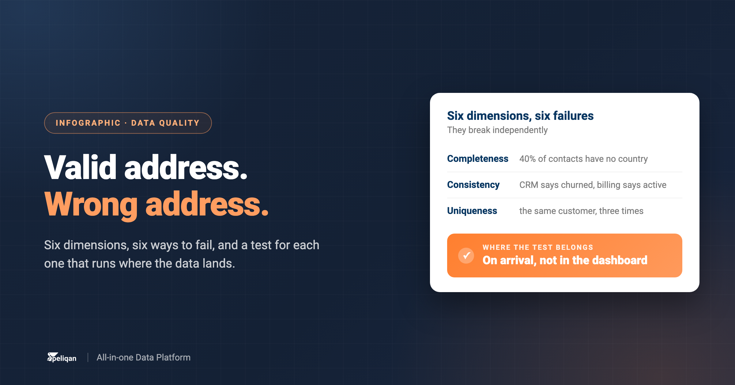




Data quality is not one property. It is six, they fail independently, and each has a test you can actually run. The diagram below shows what each dimension means and what it looks like when it breaks.
The six dimensions
- 1Completeness – are the values that should be there, there? Fails like this: 40% of contacts have no country, so regional reporting silently excludes them. Test it by measuring null rates on fields you actually depend on, not on every column.
- 2Accuracy – does the value match the real world? Fails like this: the address is perfectly formatted and the customer moved last year. This is the hardest dimension to test automatically, because it usually needs an external reference to check against.
- 3Consistency – does the same fact agree across systems? Fails like this: the CRM says churned and billing says active. Test it by reconciling counts and statuses between systems on a schedule, and alerting on the gap.
- 4Timeliness – is it current enough to act on? Fails like this: yesterday’s stock level, used to sell something today. Test it by monitoring freshness – the age of the newest row – rather than whether the job reported success.
- 5Validity – does it conform to the format and the rules? Fails like this: a delivery date before the order date. Test it with constraints and range checks at load time, which is the cheapest test in this list.
- 6Uniqueness – one real thing, one row? Fails like this: the same customer appears three times, so revenue per customer is wrong in a way that looks plausible. Test it with duplicate detection on business keys.
Where the test belongs
On arrival, not in the dashboard. A test that runs when data lands can stop the load and alert someone; a check that runs in the BI tool only tells you the meeting you are already in is using the wrong number. Freshness, row counts and null rates catch most real-world problems and cost almost nothing to run.
What to measure first
- Freshness on every table a dashboard depends on.
- Row count deltas, to catch a partial load that reported success.
- Null rates on the handful of fields your key metrics are computed from.
- Duplicate checks on business keys, particularly after any pipeline retry.
Quality and the systems around it
When a test fails, the next question is what else is affected, which is a lineage question. Deciding who fixes it is a governance question – quality without an owner is a dashboard nobody acts on.
What this looks like in Peliqan
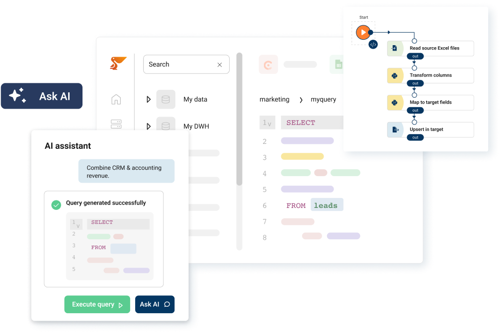
Because data from 300+ sources lands in one place, checks can be written once in SQL or Python and run across every source on load, rather than being reimplemented per tool – and a failing check can alert before the number reaches a report.
Use this diagram wherever you like
The diagram is free to use, including commercially, as long as there is a visible link back to this page. Download the PNG for slides and documents, or the SVG if you want to edit the labels. No email required. You can browse the rest of the set in the Peliqan diagram library.
Ready to build this on your own data? Get started with Peliqan.